>
New Topic
>
Reply<
Esato Forum Index
>
General discussions >
Rumours
> Nokia Windows Phone 8 prototype revealed?
Bookmark topic
What about the Lumia 900? Well, it might not be such a looker, as it lacks 610's glossy curves and rounded shape, but it still looks better than Mint:

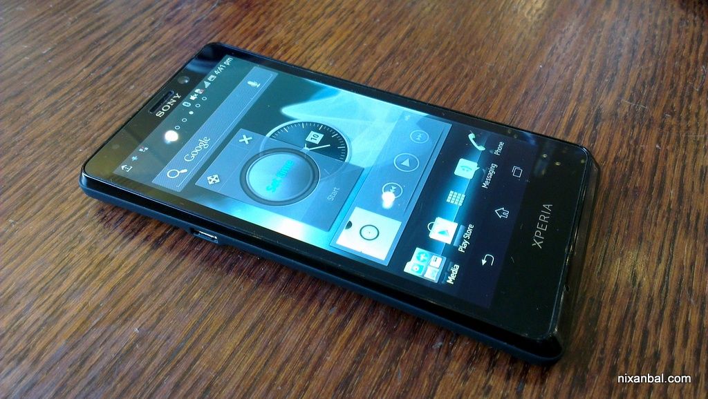
And, if you look closer, you'll see that the Lumia resembles much more Xperia Neo, with the only difference that they've rounded the left and right sides, instead of the top and bottom ones. This should have been the new Neo! Not craps like that clumsy Mint! And please try to convince me that Mint has no problems with the viewing-angles!
[ This Message was edited by: mediar on 2012-08-07 20:52 ]
--
Posted: 2012-08-07 20:54:13
Edit :
Quote
So, you called my fanboy just because I personally NXT looks better, but for you to say how crappy looking Mint is when some of us here tend to like it better, especially since Mint wasn't even yet announced and doesn't have any official pictures. so if I'm a fanboy, I'd you're a hater, and you force your opinion to others. no offense with that

and sorry mate, the picture you've given above (especially that color simply shows that the Nokia still looked like a toy compared to your Pro. now I wouldn't even think about arguing with you further as it seems we're battling on something we can never agree together with.
And, if you look closer, you'll see that the Lumia resembles much more Xperia Neo, with the only difference that they've rounded the left and right sides, instead of the top and bottom ones.
Sorry mate, no matter how I try to think of it, Nokia 610 doesn't hold a candle to Neo in looks, let alone resemblance,
This should have been the new Neo!
now that would be a disaster

Not craps like that clumsy Mint! And please try to convince me that Mint has no problems with the viewing-angles!
and try convincing me that Lumias don't have a problem with screen resolution

as I said, Mint wasn't announced yet, so we still don't have official pics to drool for, and everyone in esato knows that SE/Sony phones do look ugly on leaked pictures but the official pictures always looked miles better, the Anzu - Arc is the prime example

I don't think there's really point in arguing things like this, it all boils down to our respective opinion towards how we see them with our very eyes. It's true I'm a fan, but I'm not blind to ignore the good/bad sides I can still see with Sony/SE, I don't know about yours though as It seems to me you keep bashing Sony/SE these days and never even accept what's the good side about them. that's what I'd call a hater. and just so you know there were several times I did bash Sony as well.
--
Posted: 2012-08-08 01:34:37
Edit :
Quote
I like both the Lumia and the NXT design a lot, but of course I'm gonna choose my XS's looks over the Lumia.

Lovin' the transparent strip and minimalist fascia.
--
Posted: 2012-08-08 01:52:00
Edit :
Quote
^^ Tell me Nightblade, don't you want your Xperia to look like Satio/C905? at least on the back?

--
Posted: 2012-08-08 02:17:36
Edit :
Quote
Geez! Nokia Lumia 610 is ugly IMO. The Pro is gorgeous compared to it. The Lumia 900 on the other hand, does look really nice. But I'll still give the edge to Sony NXT line up. The front especially of the Sony NXT range > Lumia 900 front.
@razec
I for sure would want my XS to have the Satio back

--
Posted: 2012-08-08 11:14:19
Edit :
Quote
Well, razec, it seems you don't like the Lumia 900, but you liked Aino, right?


Tell me where's the difference. If Sony wants minimalism, Aino's design is the right way, not Mint's.
--
Posted: 2012-08-08 17:44:48
Edit :
Quote
You know why i liked Aino?
It's because of this:


I look at the Aino as a
whole package which is what made me love the phone. it may have a minimalistic look in front, but that's not just all. because it's a fresh design coming from the japanese style which I loved. what you just shown was the part which holds nothing to what made the Aino popular at least among fans

Aino is not your typical minimalist mobile phone, it has something else in it as compared to the really basic look of the Lumia 900 from its front to back. If you read my previous posts across different threads, you'll see I do hate minimalistic looks, I want something really different! but that doesn't mean I should ignore what I see in Lt29 as one of the nicest approach on candybar smartphone design as compared to others:
also just in case you don't know LT29 will have some nice novelty on it:
And why I liked the NXT design? here's the reason

^^ that was a clever use of the rather typical

LED notification
and as I said, don't judge the looks until you see it official
Example: the "Ugly Xperia Tipo"

Xperia Arc - during rumors stage

Xperia Arc - official

now who's better looking?

 PS
PSMy apologies for being offtopic I just want to express my opinion as to why I disagreed with mediar: I ask for the little understanding on the moderator's part for this

[ This Message was edited by: razec on 2012-08-09 05:14 ]
--
Posted: 2012-08-09 06:09:54
Edit :
Quote
Theres only one S/SE Phone which i was so impressed withthe looks, its the se experis arc s but only when its powered off, when turned on it seemed the screen dropped several milimeters down. Never liked any samsung looks and for nokia, the n9, i would have loved the lumia 800 but i dont like seing the soft buttons eating a chunk off the display
--
Posted: 2012-08-09 07:53:11
Edit :
Quote
Love Windows phone more than anything out there and its only gonna get better. As for design I love Lumia 800/900 it looks and feels gorgeous in the flesh
--
Posted: 2012-08-12 02:53:00
Edit :
Quote
The diferent preference of people, i personally hated the line/belt of tne current experia series. It seems to me that it makes the phone longer tha it needs to be, a waste of space and a huge distraction to the screen when lit up. After that line there still lays a huge block whatever that thing is that certainly made the phone even longer. to me looks like an external battery...while others so love these.
If only windows lose those soft buttons that they only appear when needed, would have love the lumia 800 so much
--
Posted: 2012-08-12 07:52:16
Edit :
Quote
New Topic
Reply


 LED notification


