>
New Topic
>
Topic Locked
Esato Forum Index
>
General discussions >
Rumours
> The All New Sony Ericsson Portfolio for 2008
Bookmark topic
This looks really cool :)
--
Posted: 2008-01-28 18:27:50
Edit :
Quote
a logo need not be very complicated, just have a look at the bravia logo

--
Posted: 2008-01-28 18:31:41
Edit :
Quote
In my view the Xperia-logo is really SE-like:) But the Bravia-logo is not typical for Sony Ericsson. Do U understand what I mean ;)
_________________
Sorry for my Mistakes, but i´m an 15years old German =)
[ This Message was edited by: paba92 on 2008-01-28 17:37 ]
--
Posted: 2008-01-28 18:36:41
Edit :
Quote
On 2008-01-28 18:31:41, jack00 wrote:
a logo need not be very complicated, just have a look at the bravia logo
Exactly, the Bravia logo is so simple and elegant. It doesn't need to be 'over the top'.
Just because Bravia technology is the flagship of Sony TV's, it doesn't need things flying from the letters and such like. It's just perfect for what it is meant for.
_________________

T650i -
S700i -

760 Next...
Loyal o2 UK Customer
[ This Message was edited by: Lunion on 2008-01-28 17:44 ]
--
Posted: 2008-01-28 18:43:06
Edit :
Quote

--
Posted: 2008-01-28 18:53:27
Edit :
Quote
@Sealover94: Is this your own creation of the Xperia logo?!?!?
--
Posted: 2008-01-28 19:01:46
Edit :
Quote
I didn't mean the logo need be complicated, but it should be standing out whereas this xperia logo looks like the average Times New Roman and
ALIKE.
[ This Message was edited by: not_me on 2008-01-28 18:07 ]
--
Posted: 2008-01-28 19:05:55
Edit :
Quote
Sealover's logo is great.
Bravo vre megale
--
Posted: 2008-01-28 19:06:06
Edit :
Quote
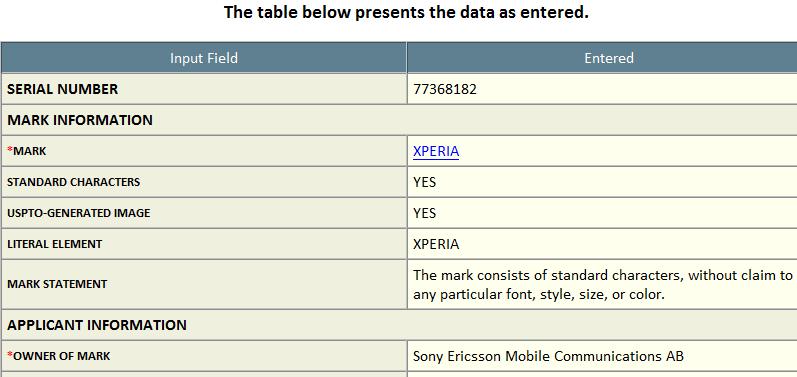
I just realised it is Times New Roman, which they used, so it can't be the official logo/writing after all :
Times New Roman :

Xperia writing used :
--
Posted: 2008-01-28 19:12:36
Edit :
Quote
They patented the name. Just the name, without further details to font, size, design, whatever.
--
Posted: 2008-01-28 20:46:23
Edit :
Quote
New Topic
Topic Locked
