General discussions : Concepts of phones, accessories and user interface : Sony Ericsson Concepts - 2009
>
New Topic
>
Topic Locked
Esato Forum Index
>
General discussions >
Concepts of phones, accessories and user interface
> Sony Ericsson Concepts - 2009
Bookmark topic
@tob!s: no sunny orange. the blue and grey look much better: D. A

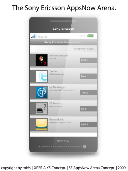
AppStore?

@echo.shane: that xenon flash is big. perfect for night shots. is that a video call camera at the top right corner?
--
Posted: 2009-07-24 15:43:09
Edit :
Quote
Yes, Sony Ericsson AppStore.

You will se it later...

--
Posted: 2009-07-24 17:35:47
Edit :
Quote


--
Posted: 2009-07-24 18:32:00
Edit :
Quote


--
Posted: 2009-07-24 18:39:49
Edit :
Quote
On 2009-07-24 18:32:00, tob!s wrote:


@tob!s
Very Apple-ish

but your Xperia concepts are awesome, in contrast to trance, i like the sunny orange

BTW, so many great looking concepts here after a long silence. @echo i love your two new concepts, especially the back part.
--
Posted: 2009-07-27 03:49:04
Edit :
Quote
im trance
d 
it had to look apple-ish. appstores from apple

--
Posted: 2009-07-28 22:44:13
Edit :
Quote
^^ My bad, sorry for that

Anyway, Is there a way to import Flash files (swf) here? i hope so as i'm planning to post my new UI concept here...
--
Posted: 2009-07-29 05:48:22
Edit :
Quote
hi guys. been quite a while since my last contribution. ive been working on 2 phones: a psp phone and a hybrid of the xperia and entertainment unlimited lines. both phones feature never-before seen slider concepts. unfortunately, im technically challenged. i have isometric drawings but i do lack 3D rendering skills. can someone please PM me if you want to collaborate on this little project?
Vielen Dank!
--
Posted: 2009-07-29 07:08:24
Edit :
Quote
I want to show you my simple suggestion for the blog for Symbian^2 UI suggestions. Mine is for separated Explorer, who we to be able to minimize or close. It's something between the UIQ file explorer and Windows 7 Explorer. Here it is:

I can explain you everything on the picture.
What do you think? Is it a good one or it is stupid?
[ This Message was edited by: mediar on 2009-07-30 17:40 ]
--
Posted: 2009-07-30 18:39:23
Edit :
Quote
Nice mediar but the icons look too small to be finger friendly. Its going to need a stylus for that matter

I wish you could give it some background image to make it more eye pleasing.
My next project will be a major UI concept using WM7 and SE's strength. i hope i can post a .swf file here to show the animations and effects. i will be updating the main post before/after i posted my concept.
Give you best shot guys! esato awards is coming! i want to know who's gonna succeed muhammad oli with the
best photoshopper title

I also hope some skilled 3D designers to post their concepts here.
--
Posted: 2009-07-31 06:33:26
Edit :
Quote
New Topic
Topic Locked

 AppStore?

