General discussions : Concepts of phones, accessories and user interface : Concepts and Photoshops for Sony Ericsson Phones : 2008 Edition
>
New Topic
>
Topic Locked
Esato Forum Index
>
General discussions >
Concepts of phones, accessories and user interface
> Concepts and Photoshops for Sony Ericsson Phones : 2008 Edition
Bookmark topic
All recent concepts looking good. Congrats everyone!
@SE cz The W990 wannabe is truly appealing. A successfully updated version of W950 design-wise. Kudos for a nice effort.
Cheers!
--
Posted: 2008-04-14 22:02:34
Edit :
Quote
C802 Official:

--
Posted: 2008-04-15 09:30:10
Edit :
Quote
^^^ Cool back design, very very nice!
--
Posted: 2008-04-16 04:31:25
Edit :
Quote
Muhammad-Oli Posts: > 500
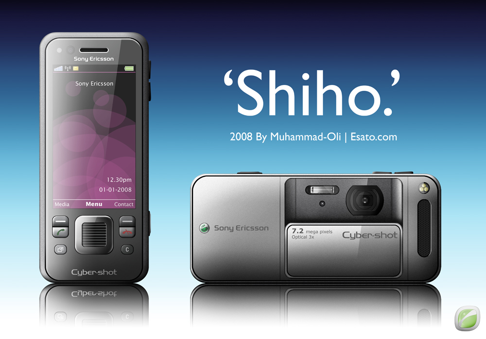
I'm loving the new concepts everyone! A lot of action in this thread lately, and maybe some of you were wondering where I was! Anyway, for the last 6 hours I've been putting this together. I think most of you will know of the rumoured 'Shiho':

I based it a lot around the style of the SO905iCS, but made it more European in appearance.
Cheers guys. Keep up the awesome work!

_________________
[ This Message was edited by: Muhammad-Oli on 2008-04-16 17:19 ]
--
Posted: 2008-04-16 17:50:50
Edit :
Quote
It has been a while, but it will be soon


with all my greetings

--
Posted: 2008-04-16 18:20:41
Edit :
Quote
OOOOO EXCITING!
Great concepts =D If you can believe it, I'm starting on a third one, still leaving my C908 on the side for now XD - maybe I'll never release that one =P too ugly XD
--
Posted: 2008-04-16 22:44:23
Edit :
Quote
@Oli: stunning concept!

i'm liking it alot

@Xajel: hmmm. yummy... love it!
i can sense some greater "storm" of concepts ahead:
--
Posted: 2008-04-17 02:27:13
Edit :
Quote
Muhammad-Oli Posts: > 500
Thanks fellas. Here is 'Shiho' again with some minor improvements as suggested by the guys in the 2008 portfolio thread:

Thanks again.

_________________
[ This Message was edited by: Muhammad-Oli on 2008-04-17 04:34 ]
--
Posted: 2008-04-17 05:09:57
Edit :
Quote
It would be better if the videolight was removed/or it's placed beside the camera - perhaps the "user" would want to use it as torch without activating the camera application.
Also - can you please incorporate your very own name logo just like the rest of the guys here did

- again, stunning concept Oli

_________________
"Our Greatest glory is not in never failing - but in rising everytime we fall"
Are you good at drawing? If yes,then show us your talent! post your artworks
here[ This Message was edited by: razec on 2008-04-17 04:13 ]
--
Posted: 2008-04-17 05:11:42
Edit :
Quote
Muhammad-Oli Posts: > 500
@razec: It is removed from the camera bit. I made that improvement from the previous version. Maybe you're confusing the LED with the light sensor?
Yeah I might do a name logo later. I thought we were using not_me's logo. I don't see much point in having two logos on the same picture.
--
Posted: 2008-04-17 05:22:18
Edit :
Quote
New Topic
Topic Locked


